



The comment came from a reader who had clearly enjoyed the article and felt a bit awkward raising the thing she had noticed. “Really useful guide,” she wrote, “but that photo at the top is not a British café, is it? There are dollar signs on the menu board.” She was right. I had spent the better part of a day writing a first-hand guide to the independent coffee shops I actually work from in my town, places I had sat in with a notebook and a flat white, and then, about five minutes before publishing, I had dropped a generic stock photo on top of it. The photo showed a warm, inviting coffee shop that happened to be somewhere in the United States, with prices in dollars and a look that belonged nowhere near a British high street.
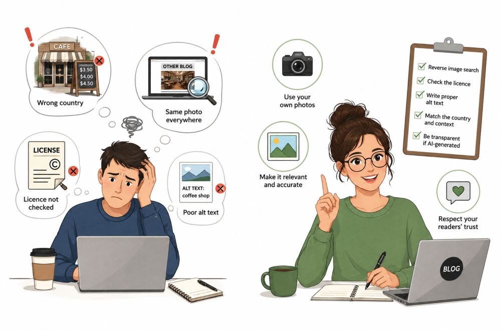
It got worse when I looked properly. A quick reverse image search showed the same stock shot sitting on top of a dozen other pages, including a couple of thin content-farm articles that had nothing to do with coffee, cafés, or my town. So my genuinely original piece, the one thing on the page nobody else could have written, was wearing a hat that everybody else was already wearing too. The words underneath were mine. The first thing anyone saw was borrowed, generic, and quietly wrong. That was when I started looking at Banana Pro AI as a way to create something more distinctive and relevant to the story instead of relying on another generic stock image.
Café In My Header Was Not Even British
What bothered me most was the mismatch between the effort and the signal. I had done the actual work. I had been to the places. And I had undermined all of it with a five-minute decision made while I was tired and wanted to hit publish. The header is the first thing a reader meets, and mine was telling them, before they read a word, that this was the same recycled content they had seen a hundred times elsewhere. That is not a small cosmetic slip. It is the wrong promise made at the top of the page.
What Actually Went Wrong
The Promise A Header Makes Before Anyone Reads
The first mistake was treating the header as decoration rather than a signal. Readers do not look at a header image neutrally. Eye-tracking research from the Nielsen Norman Group has shown that people scrutinise images that carry real, relevant information and skim straight past generic filler, and that stock photos of models and staged scenes are among the most reliably ignored. A relevant image earns attention and lends weight to the writing. A generic one is either invisible or, worse, actively signals that the page is not worth trusting. My American café did the second thing.
Same Photo Everyone Else Was Using
The second mistake was assuming a stock image was a neutral, cost-free choice. The most popular stock and free-to-use photos are, by definition, everywhere, which is exactly what makes them a poor fit for a post whose whole value is that it is original. Google is clear that it rewards original, people-first content that demonstrates real experience, and a header lifted from the same well as every content farm works against that impression rather than for it. There is a licensing dimension too that I had barely thought about. Even genuinely free images usually come with strings. Creative Commons images, for instance, almost always require attribution and carry conditions on how they are used, and “free to download” is not the same as “yours to use however you like.” I had grabbed an image on autopilot and checked none of this.
Wrong Country, The Wrong Signal
The third mistake was letting the image contradict the facts of the piece. An article about British cafés topped with an obviously American one is a small factual dissonance, and readers feel it even when they cannot immediately name it. In an era when people are increasingly primed to question what they see, a picture that does not match its context is a quiet credibility leak. UK fact-checking charity Full Fact publishes guidance on how to spot misleading images, much of which comes down to the same instinct my reader used: does this picture actually show what the page claims it shows? Mine did not, and she noticed in seconds.
Readers I Left Out
The fourth mistake was the lazy label I had given the image on the way out the door. My alt text read “coffee shop,” which tells a screen-reader user almost nothing. The W3C’s guidance on text alternatives for images is plain that an informative image needs a description of what it actually conveys. I had rushed the visible part of the header and rushed the invisible part just as badly.
How The Mistake Changed My Process
The change was less about tools and more about sequence. The header is now part of the reporting, not the last thing I bolt on. Where I can, I use my own photographs, because a slightly imperfect real photo of a real place beats a flawless stock shot of nowhere in particular. When I genuinely cannot photograph the scene myself and a stock library has nothing that fits, I will describe the exact scene to a text-to-image tool such as Banana Pro and generate something built for the sentence rather than borrowed from a shelf. That is a real improvement on a mismatched stock photo, but it is not a free pass, and I treat it with the same caution.
That caution has three parts. I check the output properly, because these tools have their own weaknesses and will happily render nonsense text and invented detail if I let a menu board or a shop sign into the frame. I disclose when an image was generated, in line with Google’s advice to share how content was made and add metadata to AI-generated images. And I no longer assume a generated image is fully mine to defend, since the law on who owns machine-made work is genuinely unsettled, as the UK government’s own report on copyright and artificial intelligence makes clear.
What I Would Tell Another Blogger
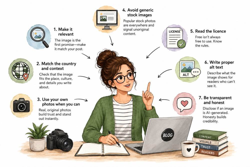
The header is a claim about the post, so make it match. Do not let the last five minutes before publishing choose your most important image. Ask whether the picture is relevant, whether it is accurate to the actual subject, and whether it belongs to the same country and context as your words. Reverse image search anything you did not make, so you know how many other sites are already wearing it. Read the licence, because free rarely means unconditional. Write proper alternative text every time. And remember that a generic image is not neutral filler. It quietly tells the reader that the effort you poured into the writing might not really be there.
Conclusion
I still keep stock libraries in my back pocket for the odd genuinely fitting shot, and I have nothing against them in principle. What changed is that I stopped letting a lazy, mismatched image undercut work I had actually done well. The reader who spotted the dollar signs did me a quiet favour, and she is still around, still reading, still gently keeping me honest. The lesson has outlasted the small embarrassment. A great post and the wrong photo are not a neutral pairing. The picture speaks first, and if it is generic, foreign, or borrowed from everywhere, it speaks against you before your writing gets a chance to speak for itself.